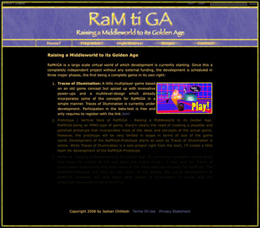
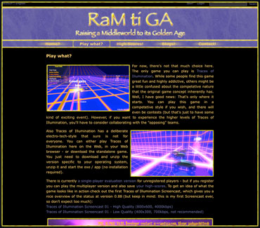
The old design of this Website has been more and more of a pain for me to look at and work with - so I'm really glad that today I can introduce: RaMtiGA - Webdesign V 2.0, a much more colorful and intense design with a left-side navigation. I'm including some screenshots of the old Web-design for the history - obviously when you're reading this, you'll be looking at the new Webdesign (unless you're reading this very far in a potential future in which I changed the design again; in which case I would also have created another blog entry with screenshots of the design that is now the current one ;-) ).
 A little more than a year ago, I had designed the new lettering and logo that I'm now using for this design. The logo between Ram and tiGA represents the world (little circle) on its path. It's coming from the "dark age" and is now on a little plateau. My feeling is that we're about to enter some really rough times (actually, this has already begun) but eventually, we will move towards the Golden Age. And that's beyond imagination, outside of any boundaries. The moment we currently experience is where perception strikes time ("striking time" is represented by the mantric tone "ti" which you may or may not know from the goddess name Sarasvati). As you may notice the whole logo also resembles an eye. This refers both to Ram (which is the mantric tone of the manipura-chakra, which is related to seeing; it's also related to the ego which basically is "how we see ourselves") and the Divine looking at what's going on here and the creator(s) of RaMtiGA looking at what's going on inside the game (you better read that privacy agreement carefully before you sign it ;-) ).
In December 2009, I posted to my public support forum - asking if people preferred top or side navigation. No one answered ... which is understandable because I haven't really enlivened those forums, yet (if you click that link, you'll notice that the forums currently don't fit the design and ... in fact ... are not really usable at the moment, which is because I have temporarily disabled them). Anyways, the reason why I asked was because while I really liked the top-navigation in the beginning, it turned out to be really cumbersome for actually working on the site. As a visitor, you currently only have 5 areas to navigate to (which worked fine with top-navigation) - but in my role as site-admin, there's 10 areas on the top-level alone, plus quite a few more in the deeper hierarchy. As you can imagine, with 10 areas in the top-navigation, I have to do some side-scrolling (even at 1920x1200).
 So, for about a year I had been waiting for a good opportunity to do a little redesign. Whenever I opened the page, I more and more disliked the colors which were looking more and more "washed out" to me.
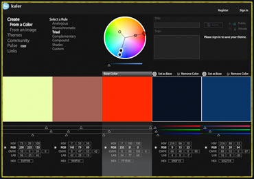
So, finally, yesterday, I read a tweet referring to an article on Web Design Trends for 2010. In general, I'm not a particular fan of following trends. When it comes to fashion (a world that basically just consists of trends), I'd even allow myself a little judgement by calling it a "destructive method of keeping people in the endless consumption loop" (destructive because creating all that "stuff" is a waste of resources). Nevertheless, that article kind of got me started (you may notice that I haven't followed any of the trends mentioned there ... at least not consciously ;-) ). Anyways, that article took me to the next: 20 Do's and Don'ts of Effective Web Typography of which I did draw some inspiration for the current design. I don't remember the exact order (and don't feel like digging into my browser history now) - but I also read The Four Key Components of a Great Web Design, which I found extremely inspiring and which finally got me into looking for a new color scheme for this site. There's a very nice Web based tool mentioned in the article, which I have used for that purpose: Adobe's Kuler.
 So ... I started playing for a while ...
... and came up with something I liked a lot.
So, the RaMtiGA lettering and logo got this glowing orange-red tone, which also makes sense because the element related to the manipura (remember: Ram) is ... guess what: Fire. I've moved away from the all-black background (I think I did follow a trend there ;-) ) to a very darkish-greyish blue. The lighter blue can be found in the marble background of the header (it's still pretty dark). Finally, this rusty red went to the "technical links" (switching language, logging in, joining, searching, copyright, terms and conditions etc.)
You may notice that I didn't use the greenish tone Kuler came up with. I just didn't like it and have the text in a golden-orange tone instead which isn't too different from the old text-color I was using. And you'll notice that I'm using turquoise which I wasn't able to pull out of the Kuler-tool. But somehow I felt like adding turquoise which is a very sacred color, too. So we have dark blue, turquoise, gold and red which may remind you a little of ancient Egypt - and that is intended. The Eye of Ra - remember? Egypt was one of the attempts of a group of very high beings from the "old times" to re-establish a culture of wisdom and power in harmony. Unfortunately, at that time the world was right in the middle of the falling of consciousness and with consciousness, Egypt fell (at some point Tjehuti felt there was no longer any point in trying and left his body behind, after about 16,000 years - and took with him quite a bit of the ancient sacred knowledge ... which, btw, is currently returning). We're now on the upswing, so even if things may look much worse - we might actually be able to raise consciousness to the point where a highly spiritual society re-emerges; and unlike around 24,000 years ago when the fall started, we're no longer naive but instead carry the wisdom of going through the darkest night and keeping an old promise in the depths of our souls.
So, anyways - 11/2009 - I photoshopped a rough sketch of the new design with the new color schemes and then went into the tough details of making this an actual WISDOM-Skin (remember? I really don't like the name DotNetNuke ;-) ). By checking Google Analytics I found out that only 5% of the users of this site are still using a 1024x768 resolution, so I made the main content area a bit wider - going from 650 pixels to 740 (it still works in 1024x768 ... but no longer "ideally"). Well, you'll probably notice that this change screwed some of the page layouts because the images were optimized for a 650px-wide main content area; not for 740px. Also, if you look closely, you'll notice that most images (not the ones in this blog posting) have a black border. That's the price of changing the CI ... that's quite intense. But better now than later (and I decided that I can keep the golden-yellowish borders because "Gold" obviously fits the theme) ;-)
 You'll also notice that I have the text of the left-side navigation right-aligned. One of the few things that were unpleasant about letting go of the top-navigation was the reason why I used it in first place: The lettering in the header being centered makes it kind of difficult to get a balanced layout when using a left-side navigation. So, I implemented this "right-aligned vertical-left-navigation" which is something I wanted to do on another Website a very long time ago (but they didn't want it for that site ... too bad, I think it looks really cool ;-) ).
Well, I guess that's probably one of the longest blog postings I ever wrote ... and the design is not completely finished, yet (I still have a few fine-tuning ideas) - but in general, I am very happy! Let me know how you like it.